Where are We, What the Hell is Going On?
Design Challenge: How might we collaboratively design a virtual exhibtion for the CCA MFA Design 2021 cohort that harnesses its digital nature to create an engaging experience?
Duration: 6 weeks
Role: Creative Lead
https://whatisgoingon.us/
Project Overview: During a year of loss, both personal and universal, the CCA MFA Design Thesis Class was posed with a unique challenge: collaboratively design a virtual exhibition of the entire cohort's thesis work. Taking on the role of creative director, I quickly latched onto the idea of loss, and getting lost. In her book A Field Guide to Getting Lost, Rebecca Solnit says, “Lost really has two disparate meanings. Losing things is about the familiar falling away, getting lost is about the unfamiliar appearing.” For this exhibition I wanted to focus on the unfamiliar appearing: how can these unique circumstances enable us to design something new and unexpected.
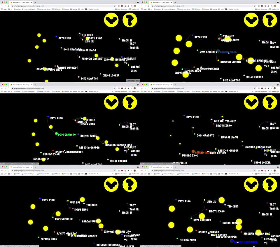
Working remotely with a group of 16 other students, we developed a concept that broke with the usual website structure and required users to do a bit more searching for the content they were looking for, and to create a sense of disorientation, of being lost. Using dots as a primary visual language, we developed a website, graphic identity, merchandise, and interactive game to bring the exhibition to life.
Tools: Figma, GitHub

Preliminary Research
We began the project by conducting research into different models of digital exhibitions. Looking at a range of examples, from digital archives to VR art galleries, we realized that the ideas of navigation and wayfinding were recurring themes in the works we were looking at.

Refining the Themes
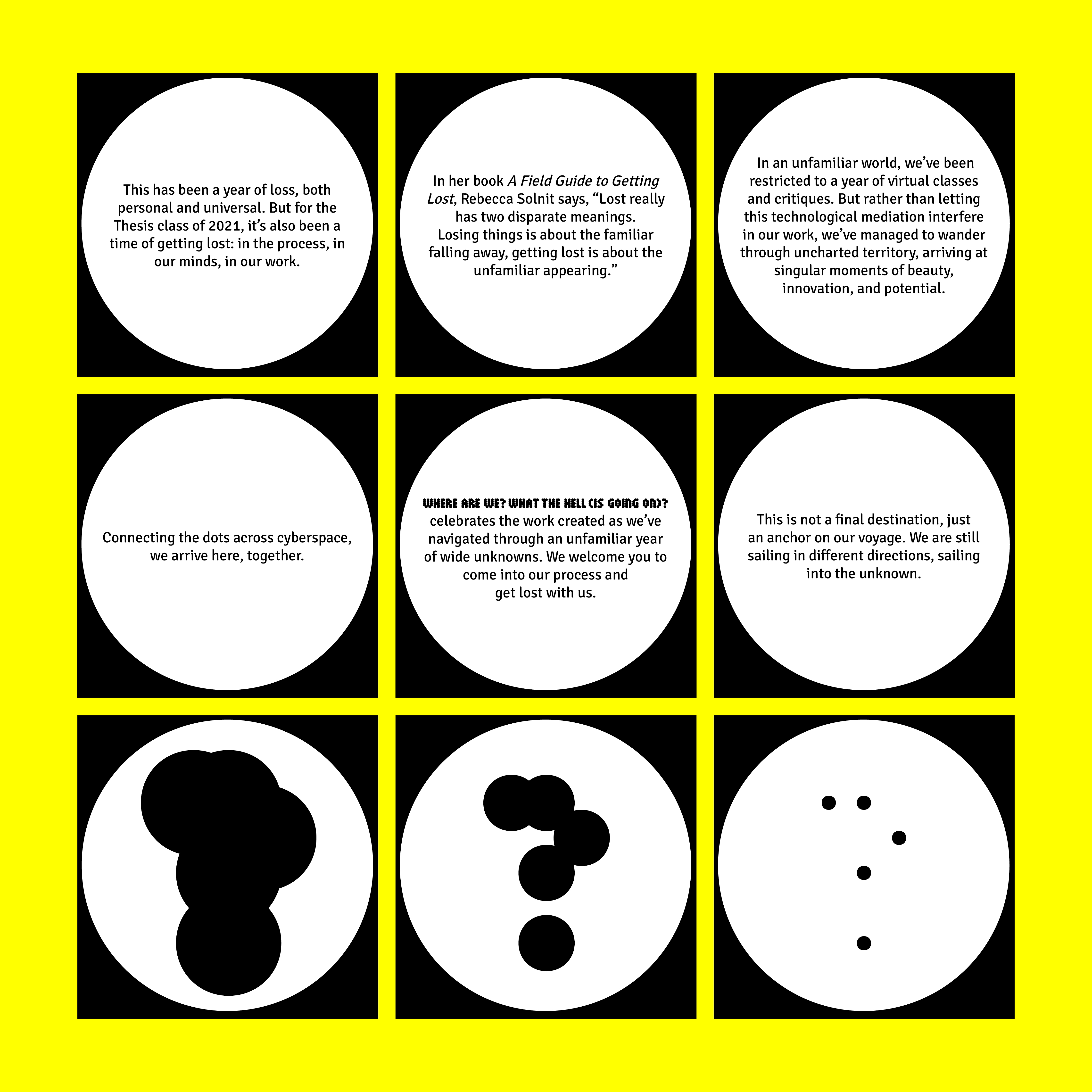
I worked with the curatorial team to refine the themes of navigation and wayfinding to focus on the idea of “loss” - both losing and getting lost. We wrote the curatorial statement, which would become our guiding force in all the design choices to come.

UX Brainstorming
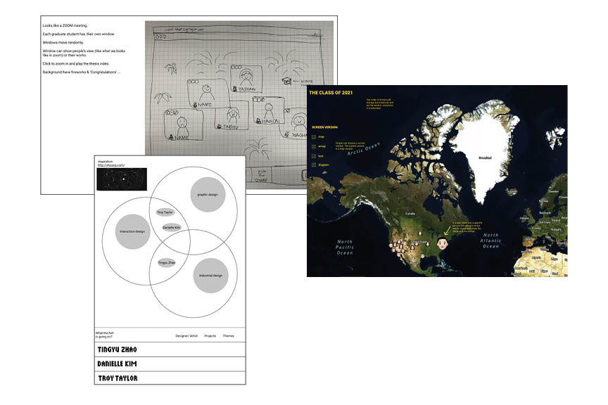
Using the idea of getting lost, we worked to explore different design options for our virtual exhibition.

Wireframing
After trying out several different options, we decided to forgo any underlying structure, and let each students name float around the homescreen. This unstructured aproach to the website requires the user to search for individual students name, creating an experience of disorientation.
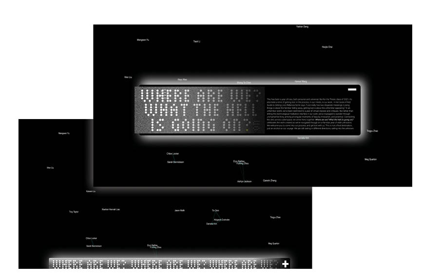
We also decided to break away from the traditional flat grid of a webpage, and create a more 3D interface.
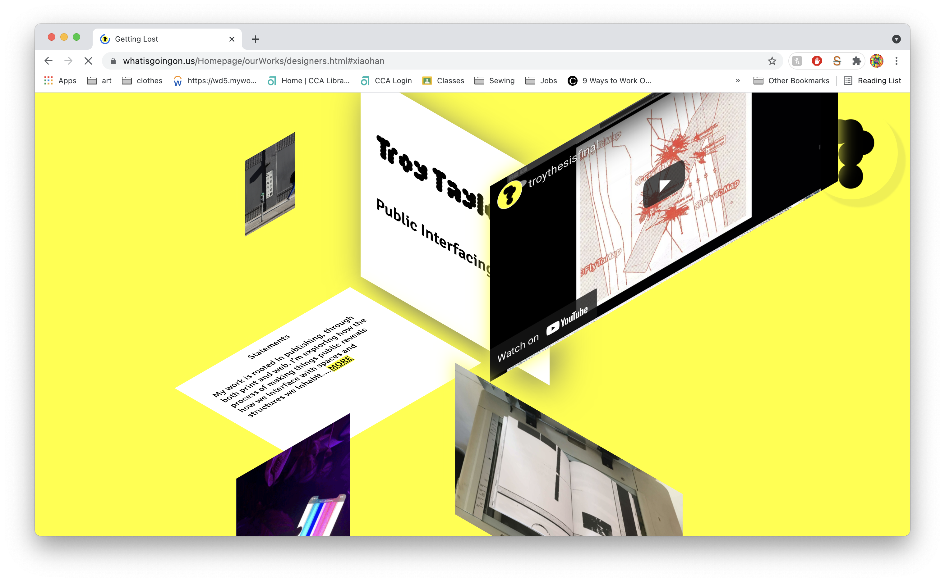
(I can’t find the wireframes 😩️)
Graphic Identity
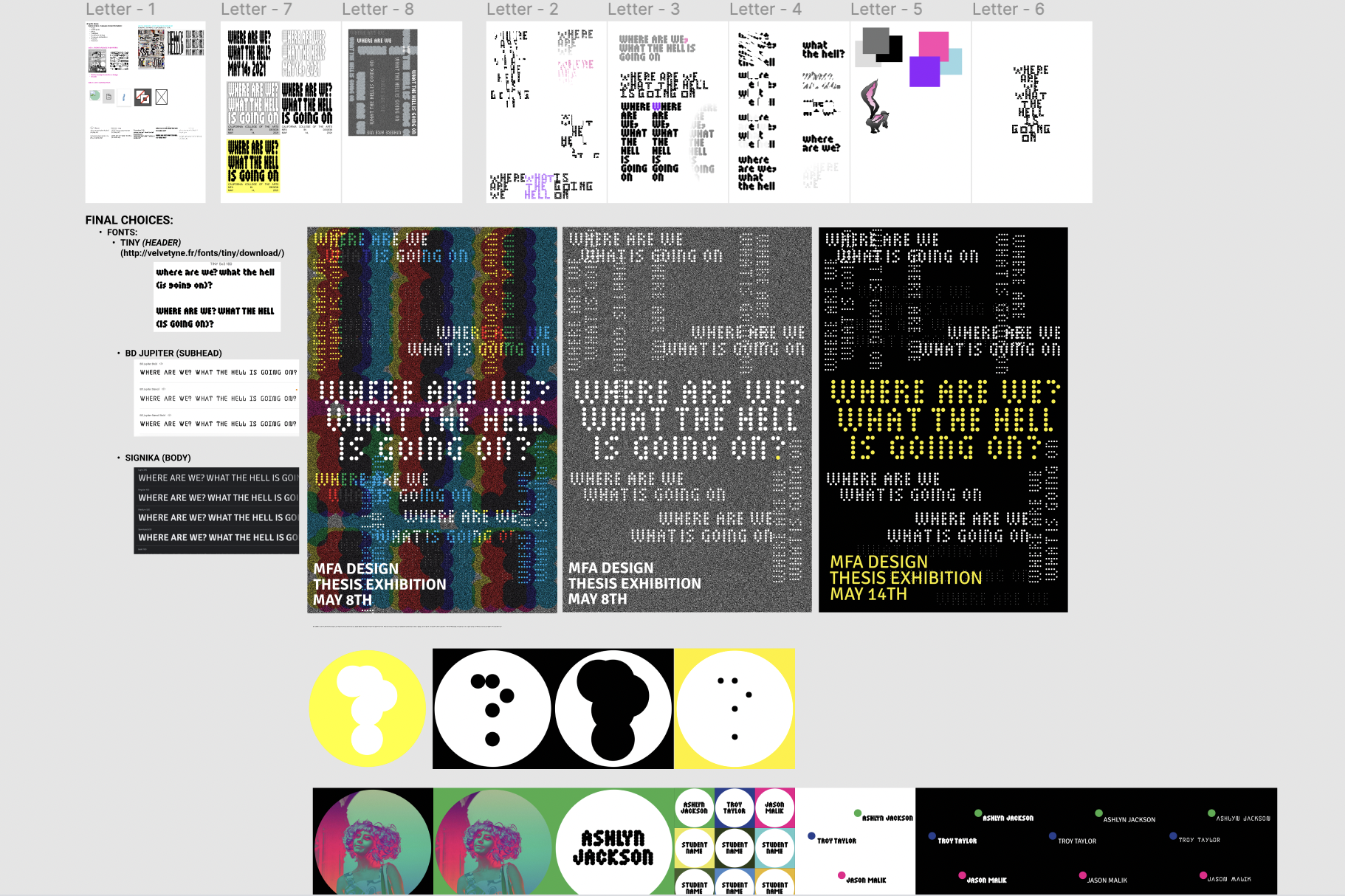
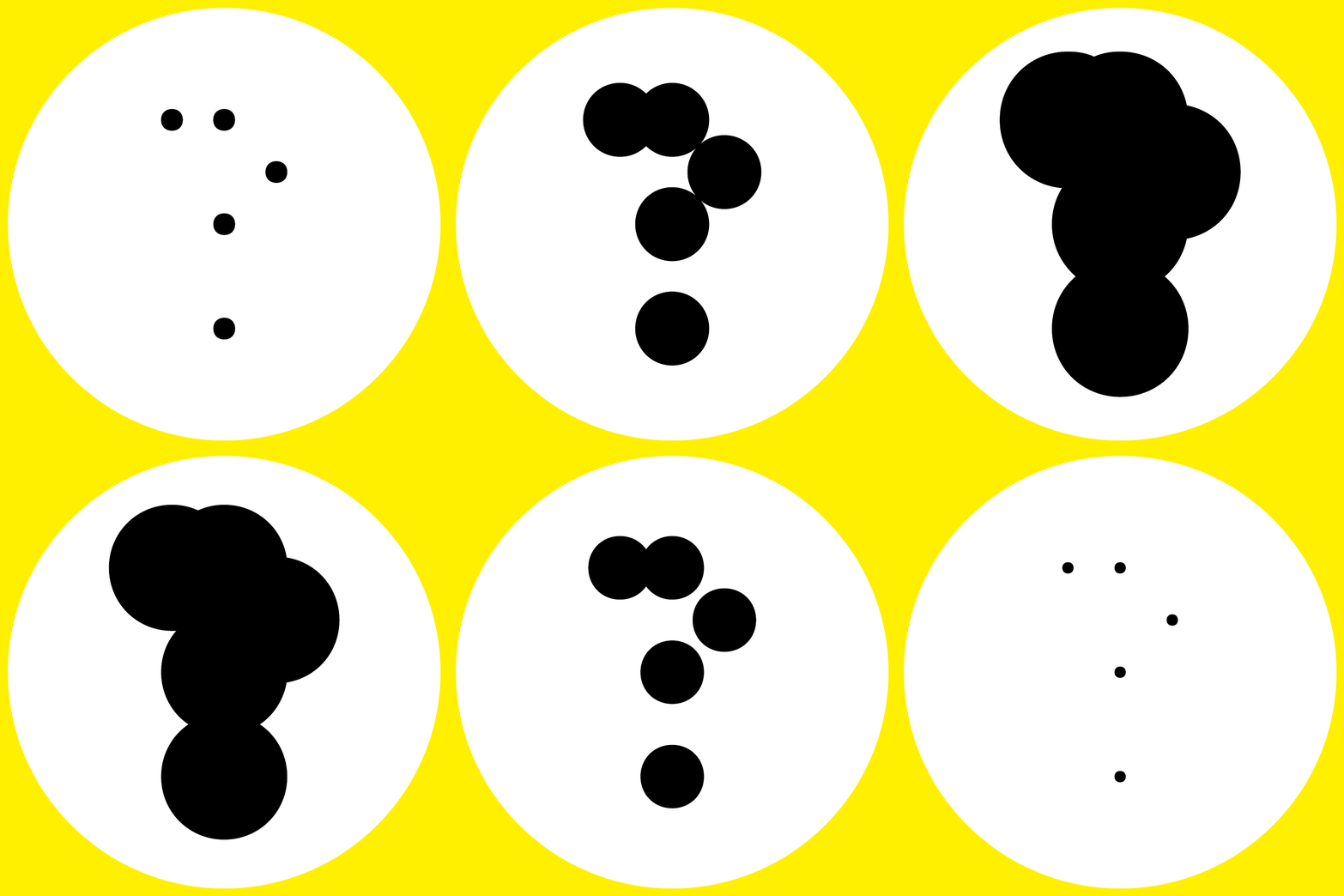
The design team used the curatorial stetment to explore several different graphic identities, all of which centered around the feeling of being lost or disoriented. The final graphic identity drew from the website design, focusing on the use of dots to create a graphic system.

Digital Presence
We used the graphic identity to create a cohesive look for our instagram account. Over the course of the weeks leading up to the exhibitionn, we showcased the works of every student in the 2021 cohort.
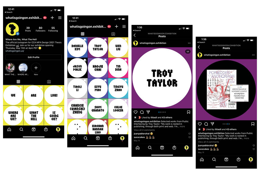
We also developed a collaborative aproach to creating instagram stories, encouraging our classmates to upload “WHERE ARE WE” and “WHAT THE HELL” stories to the exhibitions instagram account.

User Engagement
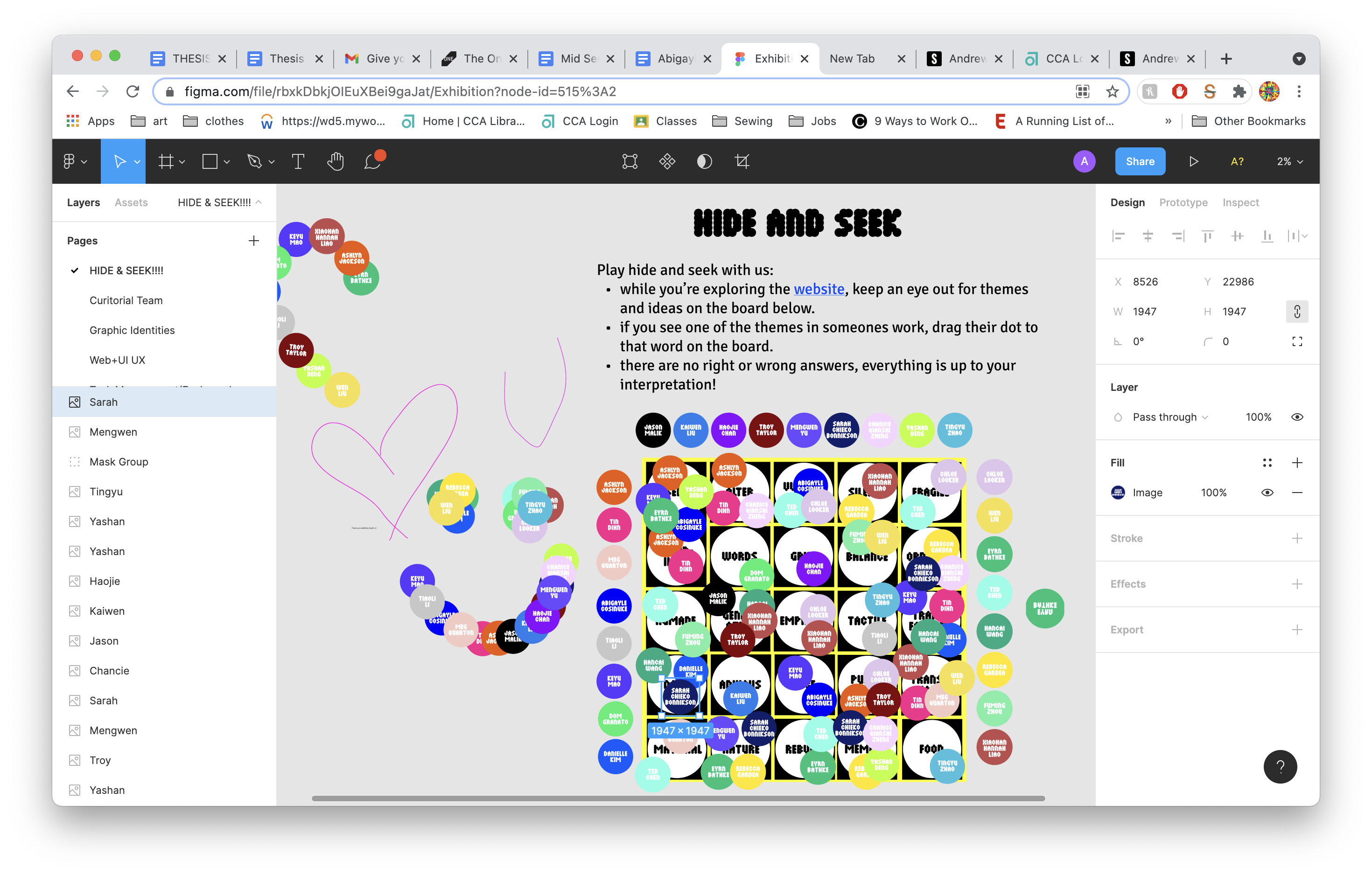
In homage of the exhibition’s namesake (the Imogen Heap song “Hide and Seek”) we used Figma to create an interactive game of Hide and Seek. We created a board that included a theme from every designers thesis project. Using “stickers” with designers’ names, users could mark the themes they saw on different designers pages on the board.
On the day of the exhibtion opening, viewers were interacting live in the Figma file, moving eachother’s stickers around, writing notes and asking questions.
